Thinking in Triplicate

“We are the principal accomplices in a process that is slowly strangling the economy, destabilizing American politics, and eroding democracy. Our delusions of merit now prevent us from recognizing the nature of the problem that our emergence as a class represents.”
— The Birth of New American Aristocracy , The Atlantic
Hey there, design pals. Buckle up, we’re going places.
If you don’t feel like reading, you can watch the talk.
Remember all that crowing about how design—interactive, user-centered, design-thinky design at scale—would change the world? After the world took a turn, that bombast died down a bit and it’s been more popular for designers to rally around empathy and delight, both perfectly fine aspects of the human experience we could use more of. And then what was starting to be called conversational design promised we could talk to our banks and home-audio systems just like people.
“Alexa, how is the weather?”
“Right now, it appears to be a red-hot shitshow. The forecast calls for intermittent frustration, increased socio-economic inequality, and dystopian surveillance continuing through the evening.”
For all the efforts of smart and well-meaning professionals, the interfaces between humans and the economic entities we’ve created seem not to be so much on the side of the humans and trending worse. (Except for Google maps adding elevation to bike directions. Big ups for that.) So, given what has been promised by human-centered design and where we are, designers as a group must be either incompetent, powerless, or delusional.
I don’t think this is the case. I think we just need to broaden our perspective—a lot.
The Three Lies of UXD
Design is the intentional solution to a problem within a set of constraints. The most significant constraint is what you think you’re solving for. Designers need the discipline and discernment to tell the sine qua non from the sine qua non-problem. Talking about designing a good “user experience” is a conventional way to construct a tidy cognitive barrier fence. If the user has a nice time, the rest takes care of itself, right? And we toss the word “good” around like we all know and agree on what it means, but how often do we ask “good for whom and why them”?
Not often enough.
The propensity to fold all interactive digital design under the heading of UXD rests on three convenient lies. Call them myths if it feels better.
Myth #1: A good experience is good for the user.
As design ethicist Tristan Harris has pointed out, if you control the menu, you control the choices. Pleasant to use doesn’t equal healthful any more than pleasant to eat does. And while Turbo-Tax may be said to be delightful, Intuit, its creator (and a past client) lobbies against free government-prepared returns, which would arguably be far better.
Myth #2: A good user experience is good for business.
Virgin America. Rdio. Google Reader. Comcast.
Which of these offered a good experience? Which of these still exists?
Myth #3: A good experience is good.
In the approximate words of Benedict de Spinoza, the most underrated Western philosopher:
1. By good, I understand that which we certainly know is useful to us.
2. By evil, on the contrary I understand that which we certainly know hinders us from possessing anything that is good
A good user experience is only as good as the action it enables. Designing a system that makes it easy to do bad things is bad. A system that automates discrimination is, by Spinoza’s light, evil.
We need to take a higher-level view
A system with a good user experience can be good for the user, good for business, and good overall, but it ain’t necessarily so. And it won’t be unless we expand our definition of good design and intend those things from the outset. This is not mere semantics. How we define and describe our work — and what we optimize for — has real world consequences.
Design is only as “human-centered” as the business model allows
Designers are laboring under defective job descriptions and a limiting framing of the field. As a result, the outcomes we claim to be able to accomplish through design—business success by way of understanding and serving real human needs—aren’t happening as much as they should or could.
If good design entailed good business, women’s clothes would come in a wide range of sizes with usable pockets and our social media feeds would unfurl in reverse chronological order with an unremarkable absence of Nazis.
Instead we have too few pockets, too many trolls, and beloved products that fail to make enough money to survive.
Design is not separate from business—design is the business
Software is eating the world.—Andreessen Horowitz
To the the extent that the business takes place in software, designing the software is designing the business. Designers either need to participate in defining the business model or they will simply be its tool.
Design is a set of decisions, a set of choices among the infinite ways to solve a problem. The more intentional and skillful the choices, the better the design. The more value those choices create or provide access to, the better the design is for business. Take our old-time internet friend Craigslist, which exhibits negligible style. The design of that system has created tremendous value for both the business and the users—and heck the casual reader too—for over 20 years.
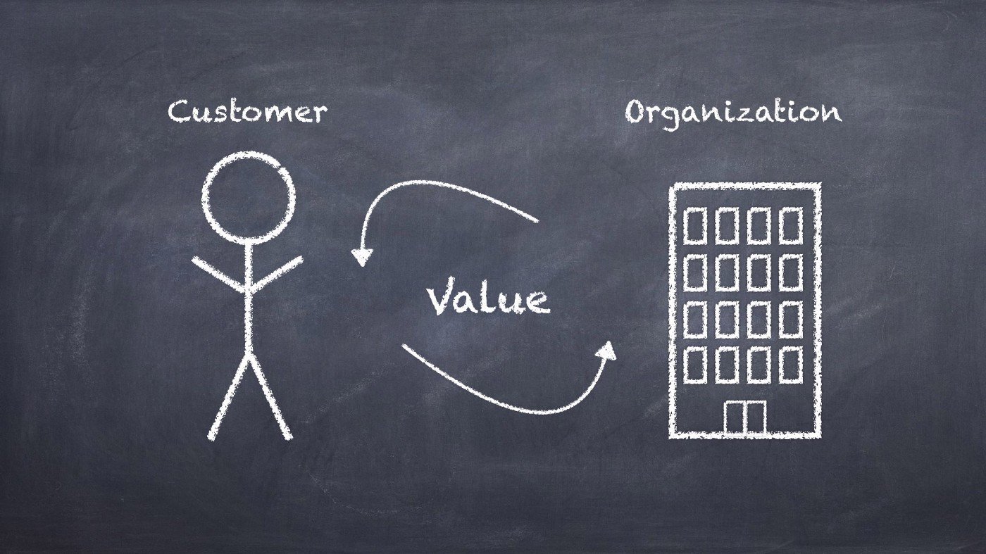
Evolve from user-centered design to value-centered design
Thinking about design in terms of the exchange of value, is the path to thinking about the whole problem. Even if a designer is making choices about a small part, they should be thinking about the whole. Otherwise they risk contributing to a beautiful experience that exploits people, or to a beautiful experience that fails. (In some businesses, like domestic US airlines, the subjective quality of the customer experience has a tenuous relationship to success. It’s good to be realistic.)
Optimizing this system is the job of the designer. (May Alan Cooper forgive me for conflating user and customer in this instance for simplicity’s sake.)
Every entrepreneur is a designer. All that talk about “designer-founders” a few years back was magnificent misdirection. We are living in a world designed by technologists for capitalists. Whatever their professional background, well-funded start-up founders are the most important designers working today in the private sector [thanks Cyd!]. It’s just that a lot of them aren’t very good.
Arguing about the symptoms exacerbates the condition
This narrow view cuts off the blood supply to the brain and makes it hard to think clearly. Bounding the field of digital design by the limits of the user experience without examining the larger system has generated several annoying and seemingly intractable issues:
Professional conversations are dominated by low-level arguments about terminology and artifacts rather than outcomes
Designers and researchers constantly have to defend gathering essential qualitative data
There is pressure to turn every piece of information into a measurement and scale it
Despite everything that is known about the principles of good design, organizations are hiring a lot of skilled designers and making crap
Attention gravitates towards incremental refinements rather than solving real problems
Great products and services attract loyal customers while on the venture runway and then go to hell once someone figures out they need to make (more) money
Communication across disciplines is worse than what Amy Adams had to deal with in Arrival
We are trashing the planet and systems are breaking down despite having instant access to all human knowledge and every form of expertise
Squeezing math from a story
Business culture and design culture are planets with different atmospheres. Business suffocates in the absence of positive numbers. Design subsists on subjective human experience.
Value to the user is qualitative. Value to the business is quantitative. In order to make holistic decisions, you have to create a representation that makes that translation. Talking about value in the abstract does this. A business gets value and meaning expressed in money (or fungible equivalent). A user gets value expressed in a mental state, in meaning.
Imagine the meeting
The legendary tension between design and business turns on the type of data used to make decisions. Professionals whose job it is to design systems that persuade millions of individuals to share photos or buy pants cannot persuade a handful of business people to trust qualitative research. You can’t fit a story into a spreadsheet.
Services that offer a sleight-of-hand conversion of notions to numbers turn a tidy profit because of this. They make out like bandits—even when the numbers are meaningless—because managers often have an irrational addiction to measurements.

The thought-terminating alchemy of mediocrity
So, we must rise to the level of a shared abstraction—the confluence of math and meaning. Spoiler: it’s a line graph. Everyone loves a line graph. Up and to the right we go!
Cutting corners is good for business until it’s not
The fundamental challenge we are up against is that doing the right thing well is generally more expensive and time-consuming than doing the least you can get away with and figuring out how to defend it. For example, the Lean methodology and the Minimum Viable Product technique are supposed to help reduce waste and increase the timely flow of useful feedback. In practice, they are used as cover for rushing to a less thoughtful solution without considering the context or the long-term implications.
Designers have found themselves having to fit their work into these popular methods without an opportunity to critique their place in the surrounding system. And critiquing the elements of a system is a fundamental tool of design.
An attempt from the business end
The point of design as we are talking about it is to make businesses more successful, so getting better design probably requires redefining success.
The triple bottom line was coined in 1994 by John Elkington as a way to improve outcomes by changing how we measure them. The bottom line is a measurement of profit and loss. A company can become very profitable while passing along hidden costs and causing a lot of harm. Elkington wanted to change this by raising the profile of those unaccounted for costs by lining up profit, people, and planet on the same balance sheet.
While this idea is appealing in theory, it is impossible in practice.
One problem with the triple bottom line is that the three separate accounts cannot easily be added up. It is difficult to measure the planet and people accounts in the same terms as profits — that is, in terms of cash. The full cost of an oil-tanker spillage, for example, is probably immeasurable in monetary terms, as is the cost of displacing whole communities to clear forests, or the cost of depriving children of their freedom to learn in order to make them work at a young age.
—“Triple Bottom Line” The Economist November 17, 2009
While his work did contribute to a wide-reaching dialog on sustainability, Elkington has waved a white flag. Approaching its 25th anniversary, just days ago, he wrote a piece in the Harvard Business Review recommending a recall, as though his thought product were a faulty seatbelt.
Together with its subsequent variants, the TBL concept has been captured and diluted by accountants and reporting consultants. Thousands of TBL reports are now produced annually, though it is far from clear that the resulting data are being aggregated and analyzed in ways that genuinely help decision-takers and policy-makers to track, understand, and manage the systemic effects of human activity.
—“25 Years Ago I Coined the Phrase ‘Triple Bottom Line.’ Here’s Why It’s Time to Rethink It”. HBR. June 25, 2018
Conceptually, the Triple Bottom Line is a compelling idea. In practice, business proceeds as usual. Sustainability, as with diversity, is a critical practice stretched thin and used like a dime-store shade to soften and obscure the harsh glare of naked capitalism. And we all know what private equity firms do to dime stores.
Value-centered design works out better for more humans
While most of the designers I know are far from objectivists, design as it is currently practiced is tantamount to Ayn Rand’s radical selfishness. We design for the experience of a single user at a time and expect that the collective experience, and the collective impact, will take care of itself.
The interface between a business and its customers used to just be…other people. The design of those—to the extent it was possible—fell to education, training, a handbook, and a dress code. Now, that interface can truly be specified, which makes it hard to get right, but easy to scale. Scale is treated uncritically as a positive and necessary value for success, but not incorporated into the design process itself.
We need to set fire to everything about our practice, or at least set it aside for a little bit, and get back to first principles.
Because so much value inheres in a digital intermediary, the interface/interaction design is the business. Any designer only thinking of the customer or user experience is doing at most a third of the job. The interaction not only needs to provide value to the customer, it must return value back to the organization or it doesn’t matter how delightful it is. And it’s much easier to create a sustainable exchange of value if you consider it from the beginning.
Otherwise, you will have a designed customer experience in search of a business model. And if the business model isn’t designed into the experience from the outset, experience will quickly yield to exploitation.
Everything I’m talking about here is an over-simplification. But the only way we can work together to solve hard problems is by creating a lingua franca of conceptual simplicity.
The concept I’d like us all to agree on is that we need to design products and services that make their users better off, make money, and don’t fuck up society or the planet. As John Elkington observed after 25 years, conceptual complexity provides cover for bad actors.
Models, what are they good for?
People who work with complex information use a lot of diagrams and models in their work. The tricky thing is that the models themselves can be well or poorly designed for the purpose. (Edward Tufte is your guy for this topic.)
The purpose of a diagram in design often to create a shared understanding to help people work together to make good decisions. Models go wrong when they have a surfeit of detail or stylistic embellishments, both impediments to understanding that arise from their creator’s anxiety about demonstrating expertise.
For the purpose of design decisions, if the model serves as a tool for quickly communicating the salient points to help people make the right decision, it’s good. If it draws attention to itself, it’s bad. The map should not be more confusing than the territory.
When you are making design decisions about complex systems, it’s easy to get lost in the details. It’s also comforting to focus on getting the details right while ignoring the larger implications.
Once upon a time, for all time
“This is an exercise in relativity, really.The shape of the curve is what matters.”
— Kurt Vonnegut
Humans run on stories. Narrative is how we organize and coordinate our frankly disordered experience of life. While this is true to the point of cliché, “storytelling” is invoked so often in design and business it can be hard to separate the hog from the wash, typically culminating in a big so what.
Kurt Vonnegut had an idea about stories that is both sufficiently true and exceedingly useful to both business and design.
After returning to America from WWII, the Vonnegut studied Anthropology at the University of Chicago. In his rejected 1946 Master’s thesis “Fluctuations Between Good and Evil in Simple Tales” he proposed that stories have shapes which can be drawn on graph paper. He identified 6 archetypical stories from western literature. According to Vonnegut, the thesis was rejected because it “was so simple and looked like too much fun”.
Enjoy this old-timey video in which he explains his idea:
Let’s take a look at Vonnegut’s graph of Cinderella. The x-axis is time, the y-axis is good fortune and misfortune. Our protagonist starts in misfortune, receives a series of incremental gifts leading to great happiness, the clock strikes midnight, she loses everything but her happy memory of the ball until the prince fits the lost shoe to her foot, and then she lives happily ever after.

A tale as old as time…oh wait, that’s the other one.
If, as Vonnegut claims, every time someone retells the story they get a million dollars, I look forward to my check.
So, an interesting thing is that if you look at the Cinderella story from the perspective of the prince, it maps to another of his archetypes “Boy Meets Girl.” (I apologize for the heteronormative examples. Western Civilization is the grandaddy of all problematic faves, and Vonnegut, as much of a humanist as he claimed to be and was, expressed several sadly retrograde ideas.).
The prince’s story starts on the upside of life—a young man of means and power. He meets Cinderella at the ball and gets happier. The clock strikes. He loses all but her one small slipper. Sad quest. Shoe fits. Happily ever after!

The Cinderella story from the prince’s point of view.
In 2016, a researcher at the University of Vermont used sentiment mining to analyze 1327 stories from Project Gutenberg and found that they corresponded to 6 basic shapes. High-five, Professor V.
To deepen our understanding a bit, we can look at both graphs simultaneously. Cinderella starts out with greater adversity, and receives good fortune incrementally, but once midnight strikes, her story and the prince’s follow a similar emotional trajectory. This view helps us visualize two perspectives and the interaction between them.

You can put the stories on top of one another!
In addition to using simple graphs to summarize and understand human experience over time, we can use them to conceptualize the way we might be able to change the trajectory.
Nothing new under the sun
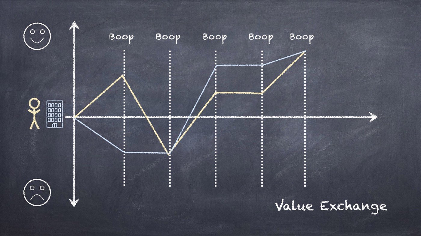
Yeah, yeah, we’ve all seen this before—it’s just a generalized, folkloric version of customer journey map, right? This very common user experience design (UX) diagram represents a series of interactions between a current or potential customer and whatever a company offers. Each moment of interaction is called a touchpoint. While that term is common, I also think it’s a little gross. So, I’ve replaced touchpoints with “boop.” Let’s see if you notice.

The Ur-Myth of User Experience
A prospective customer is walking along having an average day. They see an invigorating ad for your service. Boop. They go to your overly complicated website. Boop. They manage to find the sign-up button. Boop. They start the free trial. Boop. The service is really useful! Boop. Their trial ends and they have to start paying. Boop. The end.
It’s no Cinderella, but that is a reasonably happy ending.
Or is it?
The problem with the Customer Journey Map is its relationship to the work that comes after. The simple diagram is fantastic for understanding the relationship of various product interactions to the happiness of a single simplified customer type in one scenario. This is not without utility. It’s easy to understand and use to support shared understanding among a cross-disciplinary team. Look, using the service makes them happy and paying for it makes them slightly less happy. But, then what? How do you consider the other actors in the story, or the background context?
Often what happens is that a lot more information gets crammed into the diagram, possibly increasing precision, but radically reducing clarity. Communication gives way to documentation. Documentation makes designers feel safe. They’ve done their job. They have the receipts.
More information, but far less clear. The diagram has passed from communication, over into documentation.

More information, but far less clear. The diagram has passed from communication, over into documentation.
You can’t document a path to the future. That, you have to imagine.
Let’s look at the other, intersecting narratives that get left out.
The company story
When you zoom out, businesses have conventional storylines as well. The successful ones tend to resemble one another. Maybe the Anna Karenina principle is true and all happy families are alike.
I borrowed and simplified Paul Graham’s well-known-in-Silicon Valley start-up diagram. This diagram is popular not because it accurately documents valuation in detail, but because it tells a clear, relatable story.

This is the best-case scenario—from one perspective
Initial enthusiasm for a newish idea collapses. Reality sets in. And for the lucky few, a series of small wins and misses pays off once the company finds the magic of product-market fit, which may lead to an IPO or one giant acquisition.
Time passes. And even for a wildly successful business, there is no lasting happily ever after. Startup success may lead to growth, then maturity and, ultimately decline.

This is what happens to even successful companies over time
As industries and businesses mature, and prospects for continued growth fade, companies look for new ideas that will plump their value without cannibalizing their core business. They acquire bright young things, or start internal “innovation labs”, or turn to design thinking.

This is the fairy tale.
So, designers have customer journey maps to represent value to the user. And businesses have line graphs that represent value of the business. And even though—to put it simply—a person is not a customer without the business and a company isn’t a business without the customer, we seem to lack a way to put them together without making a giant unfun hairball that fails to clarify the relationship.
Walk and chew gum
The obvious thing is to map each point of interaction from the perspective of the business and the customer to check whether what is good for the customer is also good for the business. Delivering value, getting value.
Otherwise, unintentionally, designers will create products and services that customers love that are completely unsustainable. And even worse, designers (and everyone who makes decisions that determine what the end user sees is a designer) end up making customers miserable while generating large profits. Which means customer misery will be enshrined and papered over with branding.
A diagram like this can scale from clicks to aggregate interactions with a multiplier thrown in between user and business. Whatever! It’s all relative.
This is so simple. Yet it seems like such an infrequent practice. As John Elkington found, expressing challenging ideas with satisfying complexity is an excellent way to avoid taking action on them. Having a clear look at the gap between customer happiness and business health is challenging. It’s much more pleasant for designers to talk about empathy in one room and MBAs to talk about profits in the other and have marketers in the middle like an injectable filler. But the only hope of solving for business success and customer value at the same time is to have a conversation about that relationship in the simplest possible terms. The details follow from that.
Sometimes, a product people really value will make a lot of money.
But it’s really unlikely to also contribute to the health of the system as a whole just on accident. That’s how we end up with the tragedy of the commons. Businesses have very little incentive to do anything other than extract as much value for themselves as possible.
Now, the big picture
This is where design—making intentional, informed choices from the beginning—can be truly powerful. Only by visualizing the complete narrative, can you influence the narrative.
A lot of business is based on identifying an underutilized resource, extracting value from it, and in the process depleting the resource, whether it is forests, petroleum reserves, idle automobiles, or attention. If success for the business means harm for the system, every individual contributing to that success is doing harm.
How often do designers stand back and ask whether they are creating a real problem, that is to say a problem that exists outside the balance sheet, at the same they are solving a business problem, or delighting an individual customer?

Are you using design to make money by creating problems, or to make money while solving problems?
Work where there are real problems and you can add value to whole the system. This will take a lot of discipline. Privatizing profits and socializing losses is almost always going to be better for the bottom line, and that is what we’re up against.
Let’s put it all together—into the triple storyline!
It seems too simple, and possibly fun, but I dare you to try. Before getting down into the comforting weeds, take a big step back. Look at the three stories and the relationship among them. When you solve the user’s problem how does the business benefit? Is this exchange of value sustainable over time? At what point do you sacrifice a little bit here for a better outcome there?
Try it with someone else’s concern before your own. Map the stories of a casino, goat rental, or ridesharing.
The goal is to have a candid conversation at a level everyone making decisions about the system can understand—and come away with a story that sticks in the mind. Complexity makes some people feel smart. Simple stories get people to take action together.
And maybe we will be able to face this forgotten fact: some of the most critical problems to solve for individuals, society, or the environment will never be profitable businesses. Yet, we still have to solve them. Public sector, come through!

Visualizing the triple storyline is the first step to better solutions.
Of course what we are talking about here is a set of wicked problems. Far more than three narratives intersect with every service or solution. Once you get the hang of drawing three lines, you can start refracting the story through all sorts of perspectives. And then erase your board and redraw until you get it more right.
Not everyone gets a happy ending and it’s going to be temporary for those who do. But only when we stop cloaking agendas in jargon and complexity will we be able to use design with informed intention.
Getting simple at scale could save the world.