Hazard Mapping: The information architecture of ethics
Purposes:
To examine the hazards in our industries.
To learn how to develop a Hazard Map that workers can use to identify and locate hazards so that those hazards can be targeted for elimination.
To learn the importance of making Hazard Mapping a participatory process that involves as many coworkers as possible.
—Training from the New Jersey Work Environment Council via osha.gov
Talking about ethics in digital system design and engineering is the new hotness. Because the conversation is so fresh, we don’t yet have a lot of tools for incorporating an ethical dimension into the typical design practice.
I propose adding an additional overlay on the information architecture and UX documentation: hazard mapping. Borrowed from the field of risk management with common applications in occupational safety and disaster prevention, a hazard map highlights areas affected by or vulnerable to a particular hazard.
In the case of natural disasters, the goal is to predict hazards. In the case of occupational safety and, as I’m suggesting here, digital system design, the goal is to identify and eliminate them. We haven’t done a good job identifying and eliminating hazards because we haven’t visualized them along with all the other aspects of the design we’ve been visualizing.
Diagram of household hazards adapted from an OSHA hazard-mapping training manual.
In this OSHA training sample of a residential floor plan, the diagram is annotated with various hazards, so you can see how many and what type are in each location. (The people who made this map clearly never had dinner at my house growing up. Our dining room wasn’t that hazard-free.)
The OSHA diagram key.
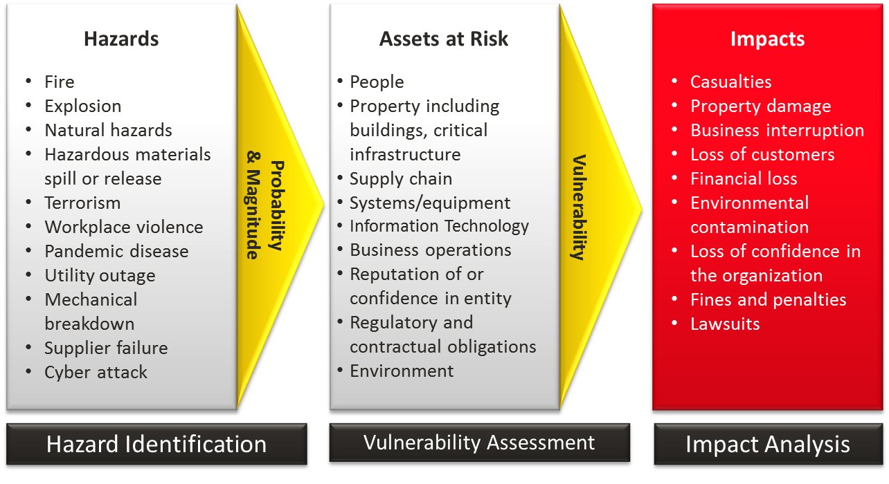
In order to map the hazards, it’s necessary to perform a risk assessment in conjunction with the design process. This will likely be uncomfortable at first in any delivery-driven, “ship fast and fix it later” environment. Just as New Jersey suggests, it should be a participatory process that involves as many coworkers as possible. Ready.gov offers guidelines for risk assessment.
The risk assessment process from Ready.gov.
Let’s do a quick thought experiment. What are the hazards potentially associated with a website, application, or other digital system? I thought of a few off the top of my head:
This is by no means exhaustive.
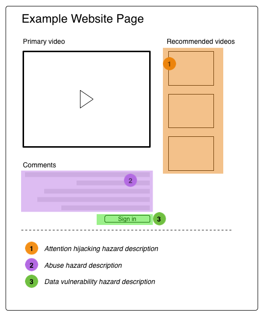
Do a little cardsorting to create hazard categories and a key. For example:
And then, apply this mapping system as an overlay on any conventional design deliverables, or as a standalone document. All maps, flows, and journeys should reference the ethical dimension and note potential hazards. This will require cross-disciplinary collaboration at every stage, as well as the development of additional expertise.
Hazard maps shouldn’t be pretty.
Developing a more ethical digital design practice doesn’t require new tools, merely sustained attention and political will. Those of us involved in creating the future, owe it to the future.


